It seems crazy, doesn’t it?
Something as abstract as color can influence the decisions people make.
I’m not just talking about everyday decisions, but those with real consequences for your business.
I mean the kind that impact your bottom line.
That’s not an unfounded claim. Research has shown that color accounts for 85% of an individual’s purchasing decision:
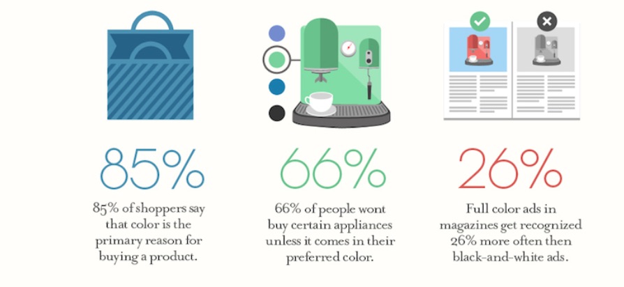
Shocking, I know.
But there is some fascinating science behind it.
It’s called color psychology, and I’ll explore some of it in this post.
First, I want to make something clear.
I’ve seen claims that merely making a switch from one color to another is the magic bullet for sky-high conversion rates.
That’s insane.
Conversion optimization is a bit more complex than that.
So is color psychology.
There’s no universal best color to use on your ecommerce website.
And no amount of psychological hacking can influence a customer if your product and messaging aren’t aligned with their desires.
With that said, using the right color schemes can have a massive impact on the way customers interact with your website.
These interactions can ultimately lead to more sales and more revenue.
It’s worth noting many variables influence people’s responses to color.
In this post, I’ll get into a few of these elements and ways you can use them to make the best creative decision for your ecommerce shop.
1. Choose colors for your brand and not just your ecommerce store
Too obvious?
You’d be amazed at the number of people who forget that choosing the right color scheme is a branding choice.
If you have no brand, it’s impossible for you to make the right decision when it comes to visual elements.
Don’t think about your store as separate from all the other aspects of your business.
The color scheme you select has to be consistent across all your business assets. I’m talking about social media, business cards, blog graphics, etc.
Before you even think about colors, get crystal clear about your brand. When you have that insight, it will be much easier to relate it to the world in visual terms.
And guess what?
You don’t need to go on a philosophical tangent to tell people who you are and what you stand for.
In fact, the best brands are ridiculously simple—yet very impactful—in their messaging.
Use the following exercises to help you gain clarity.
- In one sentence, express who you are, what you do, and whom you do it for.
- Think about one word that describes your ideal customer.
- How about one word that describes your brand?
- Decide how you want people to feel about your business.
- What problem do you solve for customers and how do they feel after it’s been solved?
Take a note of your answers. You’ll need them in the second step.
2. Apply color psychology
In the exercises above, I place a lot of emphasis on feeling.
Why?
All decisions, including purchasing decisions, are emotional.
And that is why colors are so impactful when it comes to getting people to take action.
Colors evoke emotions.
Think about it.
It’s why you’d wear a red outfit if you want to be a show stopper. That’s what red does.

If you entered a room and the dominant color was black, you’d feel a sense of sophistication and luxury. That’s the response that black evokes.

Why do we associate emotions with colors?
It’s part of our conditioning.
And it’s not just emotions. Concepts, actions, and qualities are all evoked from visual cues such as color.
That’s great news for your business. Consider the colors known to evoke the feelings you want your customers to have.
Want to come across as trustworthy and dependable? Consider blue.
Facebook, LinkedIn, and Twitter all use this color for a reason.
Have you ever noticed there’s also an abundance of blue in the financial industry?
It’s the color of security and trustworthiness, which is what you want people to feel when you’re handling their money.
PayPal uses it.
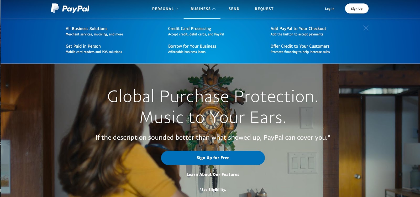
So does Citigroup.

And many others like Goldman Sachs.

That’s just one example where color is used to bring out a desired emotion.
Here are the feelings other colors evoke (both positive and negative):
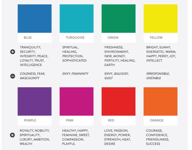
And some more …
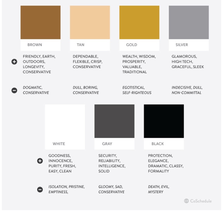
Note: This is theoretical information.
The truth is, color psychology is more nuanced than that.
Other variables need to be considered, which I’ll explore in the following points.
3. Consider your industry and your products
The space you operate within matters.
So does the product you sell.
I’ll explain with some examples.
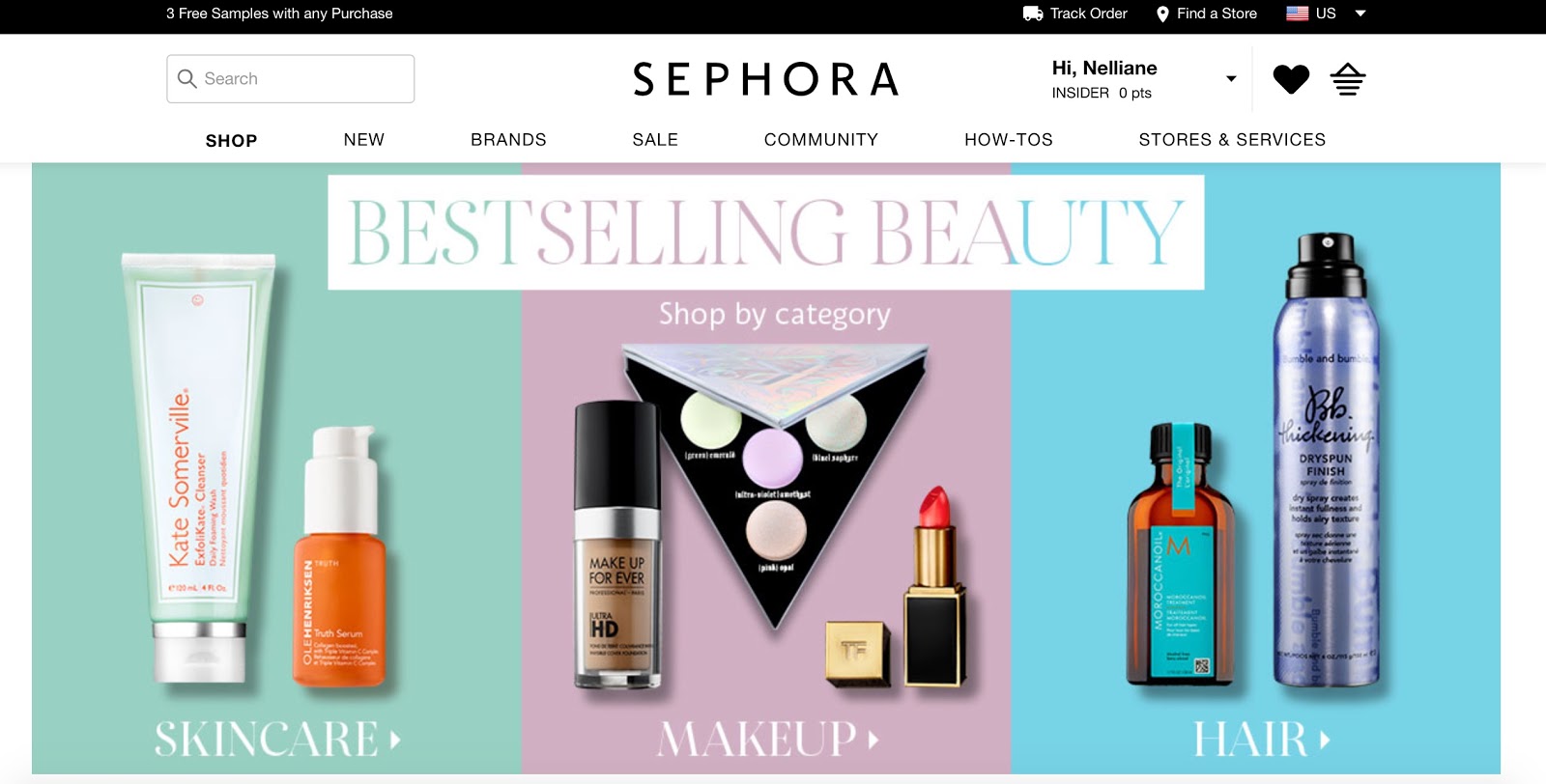
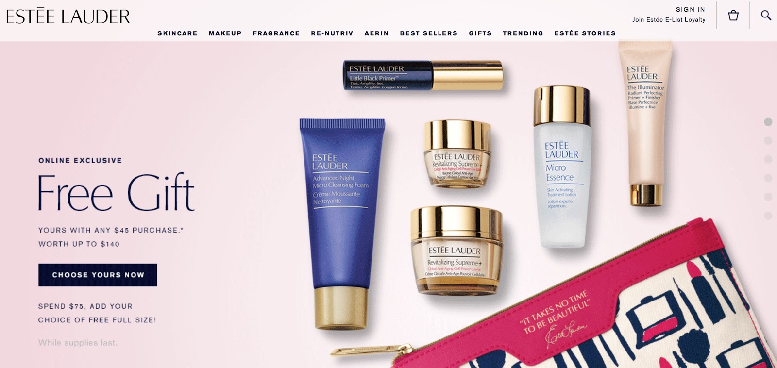
Soft feminine colors like pink, baby blue, and light green are dominant in the beauty industry. That’s because a large percentage of beauty brands are geared towards women.
Take Sephora for instance.
Or Estee Lauder.
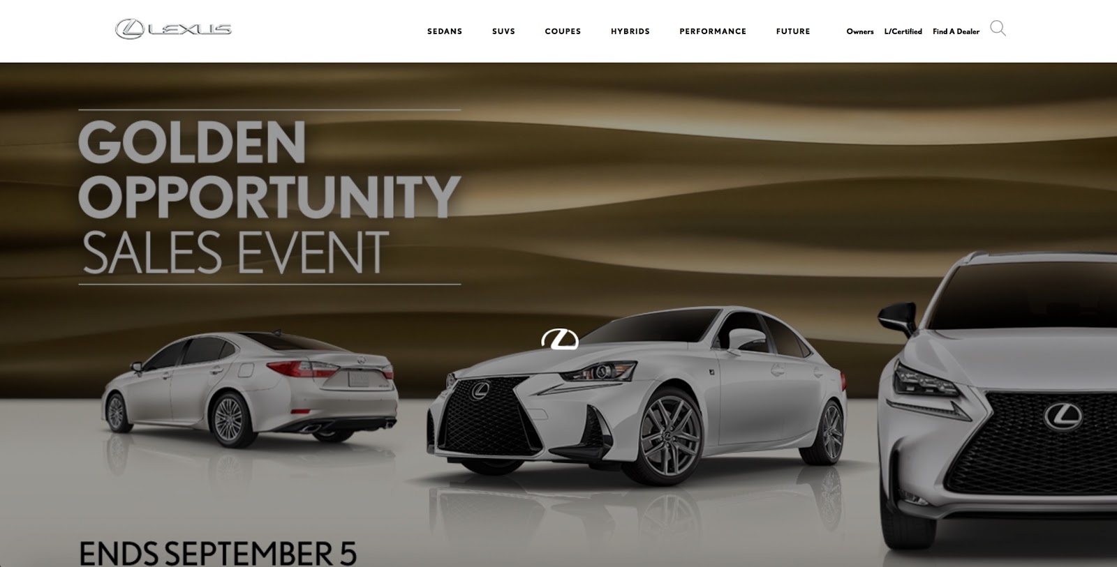
Black, gold, and silver are prominently used in the luxury automobile industry.
Take Lexus for instance.
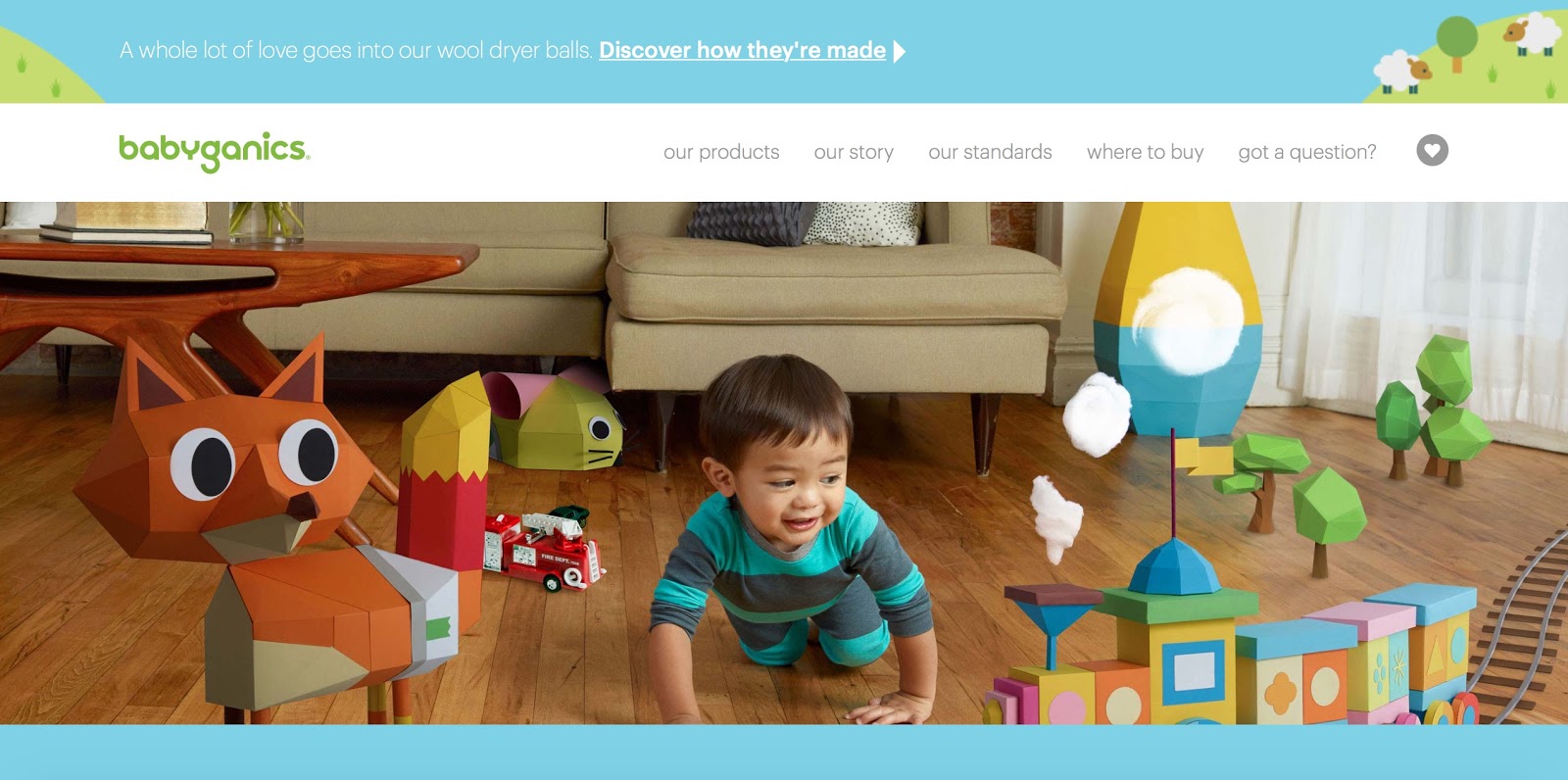
Brands with a health and eco-conscious focus, like Babyganics, gravitate towards greens, blues, and yellows.
Again, these are just a few examples.
I recommend you visit the ecommerce stores in your industry.
Examine their color schemes and other visual elements.
What works and what doesn’t?
What are some patterns that show up across the board?
You don’t have to use them, but it helps to get a sense of what’s happening within your industry.
You may even decide that a particular color is represented too much in your industry. To differentiate your brand, you can take an alternate path.
At least if you know what’s out there, you’ll be deviating consciously and not by accident.
4. Consider your target demographic
This is one of the most crucial considerations.
People have different color preferences. This means they’ll respond differently to visual cues.
Do you see how this can be tricky?
If your business targets a broad demographic, it can be difficult to pick an appropriate color scheme.
It speaks to the importance of niching down and catering to a well-defined group of people.
Whether you have a narrow or wide niche, factors such as gender, culture, and age do have an impact on color preference.
Let’s say your business targets both men and women. If you used a feminine color, you’d isolate half of your prospect pool.
The same goes for culture.
While white represents purity in the West, it communicates a whole different story in Asia.
Age has a similar effect.
In many parts of the Caribbean, purple is the color of death. But that’s mainly a social conditioning of the older generation.
With a young crowd, purple is a royal and sensual color. That’s even more so for the young female generation.
You have to consider the people you serve.
Define all the demographic factors representing them. And make a decision based on that.
5. Use the right color usage pattern
By now, you’ve seen color psychology has many nuances.
Everything—from your industry to the specifics of the people you serve—has a part to play.
What does that mean for your business?
There’s no right answer to the color question.
It’s not a one-size-fits-all solution.
But doesn’t that put you back at square one?
If there are so many variables, you can’t possibly know what to use.
There’s an easy solution.
Use a color pattern that’s visually appealing.
So simple but so effective.
Think of it this way.
The other considerations, like industry, gender, age, and culture, are there to make sure you don’t choose the wrong color.
It’s so you don’t isolate any part of your customer base by being inconsiderate to their social conditioning.
But the dominant deciding factor should be what has the most visual appeal.
This means choosing colors that complement and contrast each other well.
I’ve made this super easy with a three-step formula.
Step #1: Choose a core color.
This will serve as your base.
It will be the color you use the most. I recommend one that reflects the feeling you want to evoke in your customers.
For instance, Quick Sprout’s core color is green.

Step #2: Choose a color complementary to your core color.
Your secondary color should be something that contrasts well with your base.
A good rule of thumb is to select a color opposite of your dominant color on a color wheel.
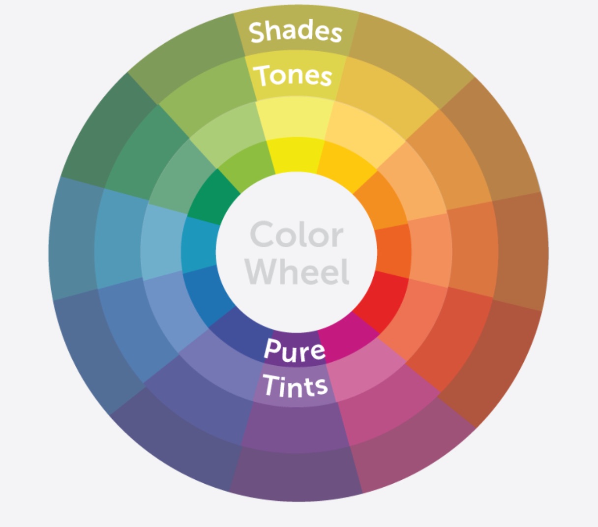
It’s important that you use the wheel.
Why?
Many people assume that because two colors are different from each other, they contrast each other well.
That’s not the case.
The color wheel is a perfect representation of the relationship between primary, secondary, and tertiary colors.
When you use it, you’re relying on the proven principles of color theory to determine the right contrast.
Step #3: Choose a color that pops against the other two.
Finally, you need an accent color.
This is one of the most important pieces of the puzzle.
Why?
Your pop color is what you’ll use for your calls to action.
I highly recommend you use it only when you want your web visitors to take a particular action.
It can be to sign up for a lead magnet, purchase a product, or click on a link.
This way, you condition your web visitors to act when they see your accent color.
Map all the touchpoints on your website that lead your prospects down your sales funnel.
These are the points where you want to use this color.
Let’s look at Ramit Sethi’s blog as an example.
Yellow is, of course, his accent color.

What’s more insightful is how he uses it.
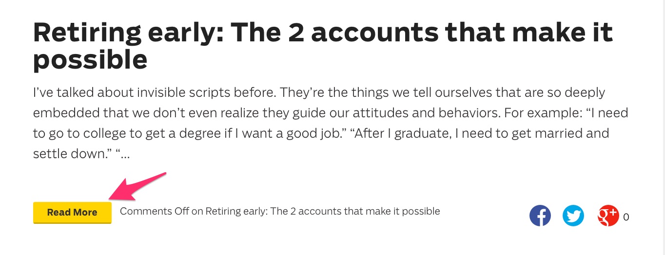
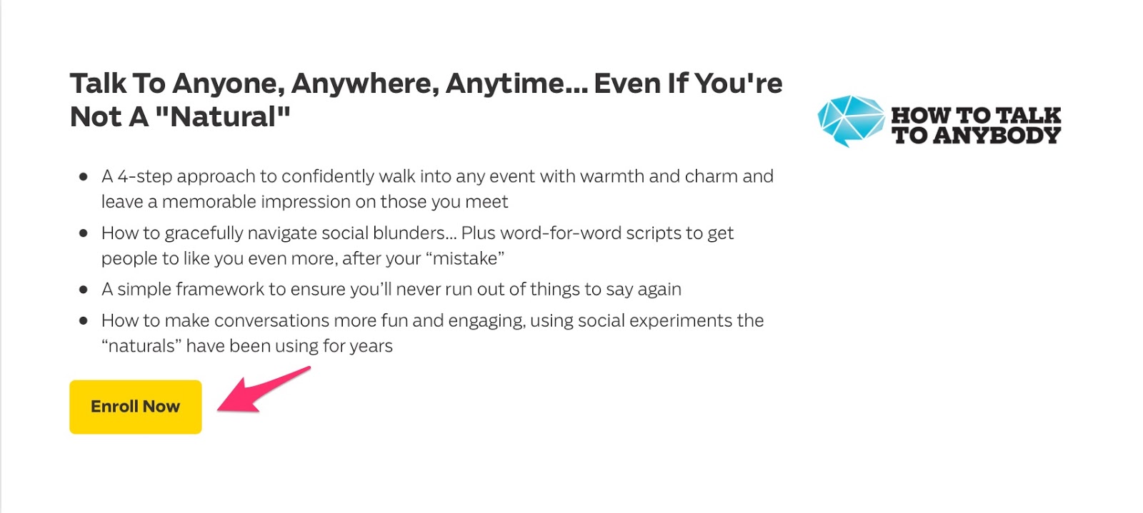
Every call to action is yellow.
Here’s a call to read more of his content:
He asks users to enroll in one of his courses:
If you have a problem or questions, he clues you in to speak to live support:

It’s a very subtle visual cue to encourage people to act.
And I bet it works exceptionally well.
How do you choose your accent color?
Let’s go back to the wheel. Since you’re using three colors in your scheme, you want to form a triad within the color wheel.
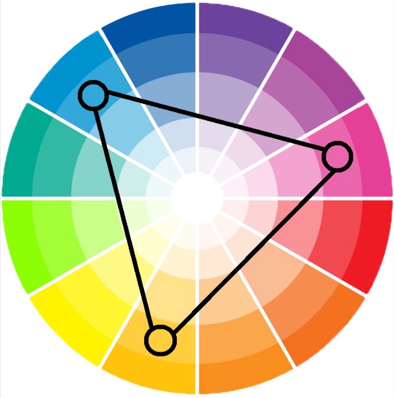
Your first two colors will represent the first two points of the triangle.
And your accent color is the last connecting point.
What if you want to use more than three colors?
It’s the same principle. Instead of a triangle, form a square or rectangle within your color wheel.
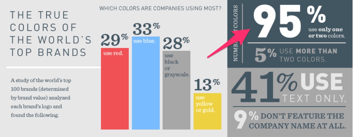
Most brands use 2-3 colors.
6. Consider user experience when selecting a color scheme
Above all, user experience should come first.
The aspect of user experience most affected by color is readability.
Nothing will make a web visitor hit the back button faster than yellow text on a white background (or some other equally distasteful color scheme).

To avoid that, you want to choose colors high in contrast.
White background and black text do the trick.
You can experiment more with graphics. Just be sure to check the contrast value on the colors to see if they complement each other.
7. Color psychology is not an exact science
By now, you may have noticed a ton of factors influence color choices.
Yes, the theories have merit. They’ve been tested and proven to work for some people, but don’t bank on it.
There are many anomalies.
For instance, many studies have shown that both men and women hate orange:
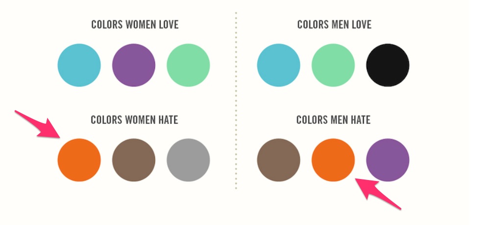
That’s insane!
For one, I love orange.

And many other brands have used this color to great success.
Amazon is a prime example.
That may have something do with the fact that orange has also been proven to encourage impulse shopping.

The point I’m making here is this:
No one color scheme will have people knocking down your door to buy what you’re selling.
It’s not an exact science because there are too many variables.
You should definitely take into consideration the theories that are out there.
But don’t let that restrict you.
Use the colors you love and find appealing.
The key is to test them to see what your customers respond to the best.
Conduct split tests and make color the only variable.
You can’t go wrong there.
Conclusion
I’m a big champion of color theory and all things consumer psychology.
I know first-hand that it works. I’ve seen the results in my business.
But I’m also big on not remaining confined to theory.
Your brand is unique.
And so are your consumers.
The only way to find out what works for them is to put the theories into practice.
See what impact they have and make adjustments from there.
I have no doubt that if you consider all the factors discussed in the article, you’ll find a color scheme that works wonders for your ecommerce business.
How do you use color psychology in your business?
Read more here - http://review-and-bonuss.blogspot.com/2017/08/how-to-choose-right-color-schemes-for.html


No comments:
Post a Comment