Your site gets more traffic from mobile devices than desktops.
So… why are your mobile conversions so low?
That’s what matters most after all. Right?
Right.
The typical reason?
Your site sucks. Plain and simple.
It’s hard to use. The organization is a mess. And it’s slow as a snail.
But there’s good news and bad news.
The good news is that the fix is easy. Just build a new site.
The bad news is that you can’t always do that. Or someone won’t always sign off on it.
Here’s why you might want to rethink that.
And what you should do if it’s still a problem.
Why your mobile results aren’t what they should be
Many sites claim to be “mobile-friendly.”
However, that’s not always the case.
The reality is that most sites aren’t actually mobile-friendly. They’re just accessible on mobile devices.
Yes, there’s a difference.
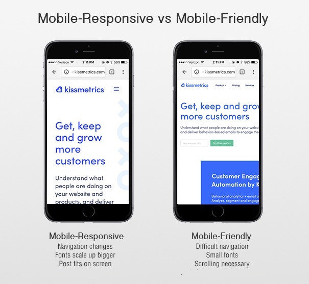
According to Frank Reynolds at Compulse, there are actually three different terms for how sites appear on mobile devices: mobile-responsive, mobile-optimized and mobile-friendly.
- Mobile-responsive sites are actually user-friendly. They’re built from the ground-up with mobile transitions and user experience in mind, and they resize and adjust proportions, images and text according to specific devices.
- Mobile-optimized sites are built as a distinct mobile version of the desktop site. They look and feel more like an app, they’re just not actually designed to be apps. These are also typically built from the ground up.
- Mobile-friendly sites are simply regular desktop sites that have an accessible version on mobile browsers. They can be designed for a mobile experience, but typically they’re just smaller versions of the larger desktop site. *This is the majority.*
The latter option is, sadly, the option most used by sites looking to add mobile functionality to their desktop site.
The reason? It’s quick and dirty.
And you can throw it on after like a band aid. No need to start over from scratch.
Which translates into “a helluva lot cheaper than building a separate mobile site.”
Unfortunately, shrinking down a desktop site’s user experience into a smaller screen isn’t actually helping with mobile-friendliness.
It’s just making it harder for users to do what you want.
To convert. To opt-in. To give you their cash money bling bling make a marketer wanna sing sing.
Here’s why.
When “mobile-friendly” costs you conversions
Mobile-friendliness (or the lack thereof) impacts SEO.
Search engines like Google look for mobile responsiveness when driving traffic to your page.
Soon mobile-first indexing will be a thing.
This means mobile sites will take priority over desktop sites when showing up on Google’s SERPs.
But when Google says they’re looking for mobile-friendly sites, what it really means is that they’re looking mobile-responsive.
You know, that third option from above. The expensive one.
If your website is not mobile-responsive – designed from the ground-up with a mobile experience in mind – you will see a decrease in search traffic.
Lost traffic equals lost conversions. Less people to buy stuff.
And that’s assuming the same rate of people buy stuff between the two. Which ain’t the case, as you’ll see in a second.
Even if your traffic numbers remained steady, not having a mobile-responsive design will sabotage your conversions anyway.
The biggest trouble is that mobile-friendly designs aren’t always aesthetically appealing.
They’re essentially just shrunken versions of a regular site that are more difficult to navigate.
You know, like the creepy dude with a tiny head on Beetlejuice.
According to Adobe, 38% of mobile users will stop engaging with a website if the content or layout is unattractive. And 65% rank display as the “most important aspect” when it comes to consuming content on mobile.
Bottom line: “Mobile-friendly” designs are killing your conversions.
Don’t listen to me. Go peep your own analytics. It’s all right there in front of you.
Three times. That’s the difference in new leads or customers.
Conversely, it means you’re losing out on 3x the leads or sales on mobile that you could be, should be, getting.
How much is an average lead worth to you?
Couple hundred bucks on the low end for B2B or high retention products or expensive average order values.
Three * a couple hundred bucks = lots of missed revenue.
Here’s what you should do about it.
Redesigning your underperforming site with a true mobile mindset
So are you doomed if you haven’t built your site from the ground up to perform well on mobile?
Not necessarily.
The trick is to not take the lazy way out.
Call it what you want. But that’s what it is at the end of the day.
Maybe you can’t rebuild your mobile site from scratch for some reason. You still should. Your reason can’t be better than tens of thousands in lost revenue each month.
But let’s say, for the sake of argument, that your friendly HiPPO won’t sign off.
Start with a simple assessment, then.
For example, begin with the design:
- How does it look on mobile? Is everything shrunken down and hard to read or is it resized appropriately and scrollable?
- How well does it respond to mobile touch? (e.g. does it zoom in when pinched, etc.)
- How easy it is for users to perform the same functions as your desktop site? Can they fill out a form as easily on a smartphone as they can on a computer?
Then let’s take a look at all of the other potential issues. Besides lost revenue. Of which, there are many.
❌ Site speed – How fast is your site? Google’s Developer Programs Tech Lead, Maile Ohye, says that “two seconds is the threshold for website acceptability. At Google, we aim for under a half-second.” Both Google and site users expect mobile sites to load fast. Yours most likely ain’t that fast.
❌ Pop-ups – Are certain desktop features needed on mobile? Most likely, no. Pop-ups and other flash-based elements can cause mobiles sites to crash, reload, and slow down. All of which will damage conversions. Then there’s the whole “intrusive interstitial penalty.” Google says to make content easier to access, not less.
❌ Finger-friendliness – Can someone tap a form field with their thumb? Mobile should be finger-friendly. Buttons or form fields that are too small will hurt your conversions.
❌ Titles and descriptions – When it comes to mobile SERPS, you have less room to work with, so you want your titles and descriptions to be short, to the point, and keyword optimized.
❌ Vertical scrolling – Can someone use their thumb to read all of a page or do they have to sideswipe to find content?
❌ Top-loaded pages – Is your most important information at the top of each page? The layout of your content may need to be different than your regular site.
❌ Modern code – Are you using HTML5? Outdated languages, like Flash either don’t work or severely limit your mobile experience.
It’s important to be honest here. You can probably spot many of these issues from a mile away already.
If your mobile site isn’t living up to expectations, you need to reconsider whether or not developing an actual mobile-optimized or mobile-responsive site is worth the investment. (Hint: Yes, of course it is.)
But if you (or someone cutting your check) is still on the fence, you can use a few tools to prove your point.
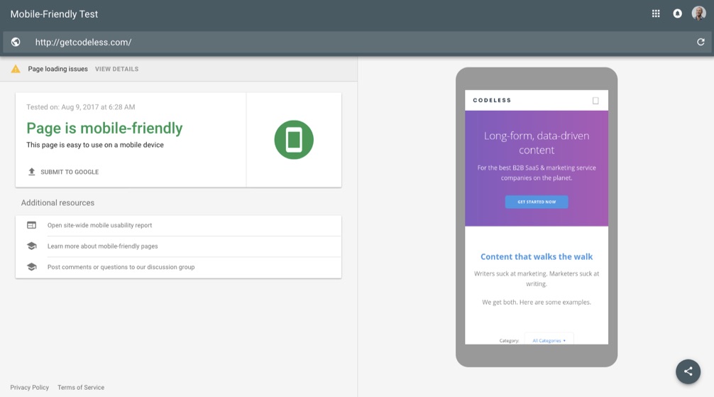
If you want to see how mobile-friendly Google thinks your site is, try using their mobile-friendly site tester.
Simply drop in your URL to get the quick verdict. The thumbs up or down.
Green is good.
You can also use Responsinator to double check your findings. It will also preview how your site looks on several different devices.
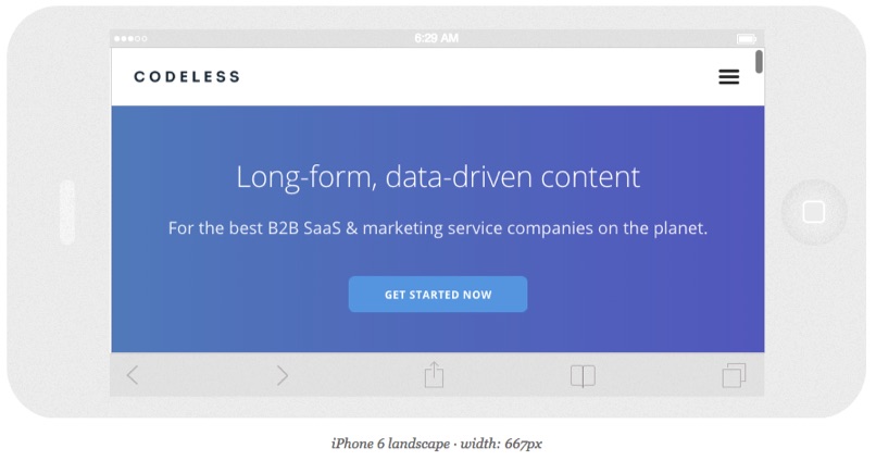
Ideally, you want to see the site stretch wide across the device. You want to see the navigation menu collapse. And you want to see individual sections of your site rearrange on their own.
If those things aren’t happening or you see too much red in the tools above, try these tips below.
5 ways to optimize your existing mobile site
If you’re not sure your site is truly mobile-friendly (read: mobile-responsive), you have a few choices to make.
✅ 1. Create a mobile-optimized site.
The website’s built. Your boss/client just hired their best friend’s mother’s sister’s cousin who took a single HTML course in junior college to rebuild the entire thing.
Long story short: It ain’t changing anytime soon.
You may need to build a new mobile site that works seamlessly with your current site. Not ideal, but better than nothing.
✅ 2. Fix your mobile site’s layout.
If your site was made by selecting a template or theme from third-party website software, you can customize for mobile users.
If you’re on WordPress, for example, you can use a separate design for your mobile theme than for your desktop theme.
This enables you to provide a different user experiences rather than simply making a smaller version of your main design.
Plugins also abound for WordPress. The problem is that these often wreak havoc on your site speed.
Here’s why that’s important.
✅ 3. Optimize your mobile site for speed.
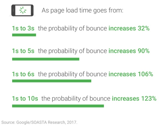
Almost all websites are too slow on mobile devices.
That finding comes from Google directly.
Even if you don’t tweak the design or underlying architecture too much (though you really, really should), consider making changes that will make your mobile site faster and more usable.
This can include steps like:
- Clean up & minify your site code
- Compress & reduce files
- Compress & crop images
- Upgrade your servers & hosting
- Minimize redirects, even 301s, when possible
- Load scripts underneath page content
✅ 4. Measure the conversion roadblocks on your site.
You can run tests to see exactly where people are having problems on your website.
There are many, many things that need to happen before someone converts.
You have various micro-conversions. Then you have funnel or checkout steps. You can even run A/B tests. IF you have enough mobile traffic.
A certain percentage of visitors are going to drop off at each.
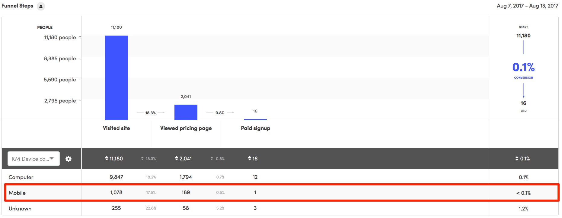
A Funnel Report can also quickly pinpoint these problem areas.
You can create a new funnel and segment the results by device category. So you’ll be able to pinpoint the difference in both conversions and conversion rate.
After the funnel, you’re still not done, of course. This is just one conversion point, for example.
There’s still multiple interactions that need to take place. That means you might need multiple landing pages and/or funnels after the fact before someone converts.
The trouble is that this quickly becomes difficult with most (bad) websites.
My favorite sneaky alternative?
Fire up a new site or tool to augment/replace these problem areas. Like your HubSpots or Unbounces of the world.
BUT, pay for them out of your own pocket or budget.
That keeps them out of the clutches of the “I Tried” department who will otherwise make your life a living hell. And most upper management literally has no idea what’s going on.
If they don’t know what a DNS is, you’re probably good to go.
Hey — we have jobs to do! Our livelihood depends on it.
One time we even spun up a new WordPress site on Godaddy to create a convenient workaround.
Are you honestly willing to let your own success be determined by people that literally have no idea what they’re talking about?
Pay the $99/month out of your own pocket. Slay the results. Get a raise paying you an extra $1,000/month because you just made the company $10,000/month.
If they won’t raise you, I will. #realtalk
It’s mean on the streets.
✅ 5. Simplify your website.
Simple websites almost always convert better.
There’s no need for the fancy stuff. Please don’t use carousel sliders. Or god forbid, parallax.
I can’t find a study on this, but I’m willing to bet that a static HTML site would convert better than most “sophisticated” ones.
It would also load faster and be easier to navigate, too.
Or just pay Squarespace.
You think I’m joking. Kinda. Sorta.
But then at least you know they work across all devices.
Conclusion
You might be able to visit a website from your mobile device.
But that doesn’t truly make it mobile-friendly.
And mobile-friendly makes a difference when you consider what matters most: Traffic, visibility, customer experience, and conversions.
Go verify this right now. The traffic and conversions from mobile vs. desktop should be all you need.
Then run your site through simple tools to diagnose what’s wrong and what needs to be fixed.
You might not be in a position to change your site. The Powers at Be might not sign off.
So get crafty. There’s workarounds if you know where to look.
Redesign pieces of your current site. You can use actual mobile-friendly templates and layouts. Even substitute pieces of your funnel with better tools.
Sometimes it’s better to ask for forgiveness than permission.
Especially when your job and financial well being are on the line.
About the Author: Brad Smith is the founder of Codeless, a B2B content creation company. Frequent contributor to Kissmetrics, Unbounce, WordStream, AdEspresso, Search Engine Journal, Autopilot, and more.
Read more here - http://review-and-bonuss.blogspot.com/2017/09/underperforming-mobile-pages-are.html




No comments:
Post a Comment